In this article, I will show you a tutorial of making Built-up Area and Repeating Flood Map by Province. You can apply the method to different types of layers and units of administration. And I hope it will be useful!
Programs used:
QGIS 3.0 Girona, QGIS Layout Manager (built-in app, no extra download)
Different versions of QGIS may look a little bit different but they work too, no need to redownload.
Layers used:
- Built-up areas 1975 – 2015 (raster) from European Commission’s GHSL database
- Repeating floods 2004 – 2019 from GISTDA (vector)
- Province boundaries (vector) from Neth’s Official Site
- District boundaries (vector) from Neth’s Official Site
- Road networks (vector) from Neth’s Official Site
Steps:
- Prepare workspace
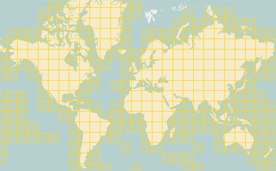
Load all layers into QGIS and arrange them as image (1). Because the global raster dataset is sliced into smaller tiles (by the provider), Thailand consists of 6 of them (the order among these tiles in our workspace doesn’t matter). It is possible to merge 6 rasters into 1, you can follow the instruction here. - Visualize built-up area layers (raster) (see image (2))
Now you can see that the built-up area layers have values between 0-6. These numbers represent built-up areas of different time period (2000 – 2014 = 3, 1990 – 2000 = 4, 1975 – 1990 = 5, older than 1975 = 3), no built-up (2), water (1), and no data (0). We want to visualize built-up areas of different time period in using different colors.
First, in Style menu, select render type to be Paletted/Unique Values. QGIS will take around a minute to load all values into Style. Then assign color for each value as you want. For me, I chose black for built-up areas older than 1975, grey for 1975-1990, pink for 1990 – 2000, red for 2000 – 2014, blue for water, and transparent for rural areas and no data. Rename all labels to be more intuitive. Lastly, repeat this step to all 6 built-up area layers. - Visualize repeating flood layer (vector) (see image (3))
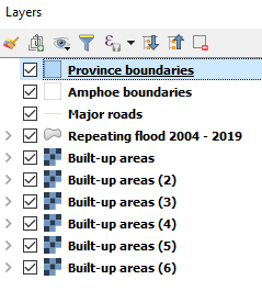
Repeating floods are represented by number of years impacted by flooding of each area. The highest value is 11 years (from the possible max of 16 years which is very frequent). We want to visualize the frequency of flooding using color ramp, darker color indicates the higher frequency. It has to be noted that the repeating flood layer comes in vector format, so style setting is a little bit different from the former raster one.
First, change rendering type (at the top most) to from Simple Symbol to Graduated to visualize number in range format. Choose variable to visualize (in this case, Repeating). Change mode to Pretty Breaks with 6 classes, so we can have nice round-up cutoffs as: 1 – 2, 2 – 4, 4 – 6, 6 – 8, 8 – 10, and 10 – 11 years. Finally, select a right color ramp, in this case, I chose white – dark blue. - Visualize province and district boundaries (vector) (see image (4))
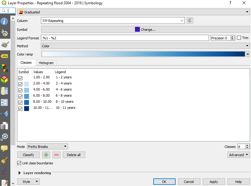
The next important layers are boundaries. Province and district boundaries, the topmost layers, should be transparent to make the other layers under them visible.
In Style menu, choose Simple Symbol and edit Simple Fill’s Fill Color to be transparent and that’s it. In terms of design fundamentals, province boundary lines should be darker and thicker than the districts’. - Visualize road networks (see image (5))
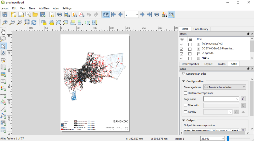
The purpose of road networks layer is to make the maps more intuitive. Just change line color as you wish. - Plot maps using QGIS Layout Manager and Atlas Generator (built-in feature of QGIS Layout Manager) (see image (6))
The last and the most difficult step. We want to visualize our maps by province with nothing outside the current province. But exporting these images and edit them by Photoshop or Illustrator will take forever time (just don’t do it).
Luckily, QGIS has a life-saving function in Layout Manager called Atlas Generator to automate this process. Please follow the step in this tutorial. There are many steps in this process but once you get the idea, it will be easy enough. I automated: province boundaries, province name, legend, and export file name. You will need to edit visualization configuration of province boundaries for a little bit too.


Remarks
- Province boundary layer mis-input BUENG KAN as NONG KHAI (so there are 2 Nong Khai in the attribute table) but the boundaries are accurate.
- Amphoe boundary layer’s boundaries are accurate but don’t have NONG BUA LAM PHU Amphoe

