
Last update: July 31, 2017 (grammar editing, add one more section on shades and shadows)
+ Scope
I have some experiences using Vray for Sketchup from 3 years of professional practices in architectural design. So I’ve decided to collect many problems and solutions I found and how to make your architectural perspectives look nicer. If you found this article helpful or have any question, please feel free to leave comment here.
I’ll update this post usually as I can, as there’re too many technical problems, please keep checking it!
I won’t write about something too basic. To follow this article effectively, you should understand the basic Vray functions: 4 layers of Vray material setting (diffuse, emissive, reflection, refraction), how to render and adjust the size of the output, etc. If you are still new in Vray, there’s a basic Vray guidebook on the internet. It’s free!
Unit in this article is in metric system, if you use imperial units, please convert it by yourself.
+ What makes any perspective look beautiful?
First topic I should write about is the factors that affect your pics. It can make your pic nice or bad as it can. And sometimes bad pics aren’t from low rendering techniques, but it’s because of…..
1. The design itself – are your design too bad or has nothing interesting? Rendering can help you in this problem (but not all).
2. Composition of the picture
- The composition of picture is well balanced (too many things on left/right side)?
- The angle of view is too narrow or too wide?
- Overall tone of the pic – is there anything too outstanding e.g. a red car in front of your green garden.
3. Details – Mies van de Rohe said “god is in the detail”. That’s home truth, don’t miss it.
- Is any wall or floor material is obviously repetitive? This can make your perspective looks like an opt art.
- Is your material realistic? Building materials are from industry, they have standard size e.g. the glass panel is normally 1.20X2.40m. Did you design have patterns by this standard? Did you leave your glass panel as large as Sketchup can do it? Be careful in this point. Grooving will make your perspective more realistic, and ‘have somthing interesting’. Don’t be hasty, design everything in your pic!
- Did you put enough props in your perspective e.g. books, vases, paintings, carpets, ee wires, light sources, trees, bushes, cars? These props will help your pics be more familiar with human senses. Put it in an arrange it as realistic as you can. For example, don’t put same stacks of books in everywhere. Arrange it one by one if you can, the more you arrange, your perspective’ll look nicer.
- Did you make your model in a real scale? The size of wide-flange/I-beam is right? The size of the table or chair is too big or too small? This can make your pic look unrealistic.
4. Harmony. Remember that if you can’t make everything look nice, make them equally ugly; e.g. 2 buildings in the pics, one is beautiful, one is not so; you have to drop the nicer one to make it look smooth.
+ Materials
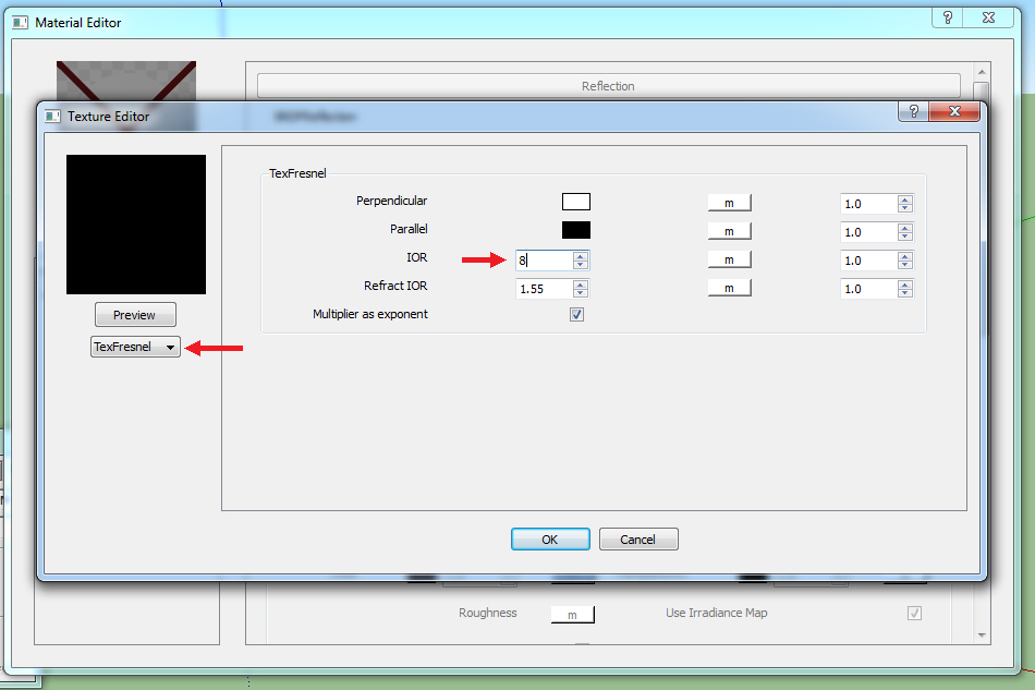
How to make stainless material
- Have a simple white material
- Go to Vray material setting. Create reflection layer.
- In BRD reflection, reflection, use Tex Fresnel.
- Set IOR in TexFresnel to 8.00
- Click OK and back to reflection setting, set Hilight’s glossiness to 0.7, and Reflection’s glossiness to 0.9

How to make running water material
1. Have translucent material
2. Go to Vray material setting. Create reflection layer.
3. In BRD reflection, reflection, use TexFresnel.
4. Set IOR in TexFresnel to 1.33

5. Create refraction layer
6. In BRDFRefraction, Transparency, change the color to white (for clear water, if you want the water to be more turbid, try different shades of grey), default color is black.
7. Change Refraction’s IOR to be 1.33
8. Go to diffuse layer, Transparency, change the color to white (for clear water, if you want the water to be more turbid, try different shades of grey)

9. Lets make water waves now! Go to Maps layer. Tick on Bump, click an m button to change bump setting.
10. Choose TexNoise->go to TexNoise, Color B->increase number of Size, Amplitude, and Frequency (The higher number, more water waves). I set Size(diameter of a wave) to be 5, Amplitude(profile of a wave) to be 5, and Frequency(more number of waves) to be 10.

11. Increase Bump no. if you think water waves are not accurate. I increased the number to 3 (default is 1).

+ Lighting
Differences between light sources of Vray and how to use it
There’re 4 types of lighting in Vray: rectangle, omni, spotlight, and IES. IES is the most realistic, but take the longest time to render. I use IES no.16 in most of light sources, because of its shape and it has 2 cones in a single one.
I use
- IES in downlight, floor lamp, wall lamp, uplight, spotlight.
- Rect light in recessed ceiling, or when there’s not enough time to set IES one by one. I’ll put the rect light plane cover the overall room, and set it to be invisible and no after reflections (right click at the IES to set in its menu.)
- Omni light when you want to show light source (you can use emissive layer in material setting instead)
Interior rendering: natural light control
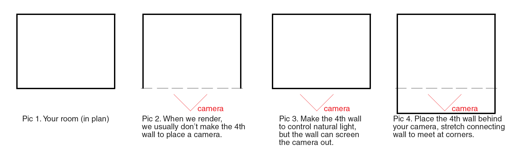
This topic is about how to control volume and quality of natural lighting in any interior space rendering. Normally, we will make only 3 side of room and one left side is for the camera, right? But leaving a large void can causes your perspective too bright, because the sunlight got into your room too much.
You have to make the 4th side of the room by your design (put it all, windows, door, mirror, cupboard, etc.). If this causes you having any trouble with perspective angle, you can move the wall a little bit far (from the real plan), don’t forget to stretch the both connecting side to join it. Look at the picture, it can explain better.
Now go to Vray Option (O button)->Environment->BG color (click an m button). There’re 3 function you have to know:
- Turbidity – higher number, your perspective will be more yellow and has more fog. Default is 3, decrease it to 2.
- Size – Size is blurness of shadow in your perspective. Default is 1, the sharpess shadow as possible. I changed it from 5-10 depends on mood of the design.
- Intensity – it is intensity of the sunlight. Default is 1, when I render, I usually add it up from 2-5.

Default setting (Turbidity 1.0, Size 1.0, Intensity 1.0), tone of perspective is a little yellow, shadow edge is sharp, and quite dark.

Set Turbidity 2.0, Size 5.0, Intensity 5.0, to make the perspective less yellow, shadow edge is more blurred, and the room is bright now. I didn’t use any artificial light source, only Vray sun.

I set my IES intensity to 10,000,000++ but it doesn’t even have any light came out. My pics are still dark.
- Go to Window->Model Info->Unit->Change unit format to be smaller (meters to centemeters/feet to inches).
- Be sure that you didn’t put your light source in the middle of sunlight.
- In normal-height room IES should be set between 10,000 to 100,000, double height is doubled.
+ Cannot render!
“We have encountered error(s) while trying to render. Please check the error log for more details”.
- Render it again, sometimes it can happen. But you can render in the second time.
- Save your file, close and reopen it.
- If the problem still remains, purge your model. Go to Window->Model info->Statistics->Purge Unused
- Hide everything that will not be shown in your pics.
- Set the style to be wireframe
- If you have any material with displacement layer, try to hide it.
- Go to Vray option->system->add more dynamic memory limit (default at 500)
- If the problem still remains, patch Sketchup, use this program http://sketchucation.com/forums/viewtopic.php?f=322&t=51537
- Sometimes you have to render twice and use Photoshop, if your room is too big, or you have too many buildings in one pic.
Displacement
If you can’t render and you have any displacement layer in your file, be sure that your displacement plane is not mixed with other normal plane in 1 component. Let me gave you an example, you have a roof component, it’s cuboid. The top plane is roof tile mat, the bottom is roof ceiling mat, and 4 other sides are eaves. -> There’re 3 materials in a single component while roof tile mat is displacement one. If you try to render like this, sometimes displacement roof will prevent rendering process.
The solution is you have to explode your roof component and redo it as 2 components: 1.normal component: anything but displacement one. In this case, roof ceiling plane, and 4 eaves plane. 2. displacement component: there’re only materials with displacement allowed for this component, the roof tile.
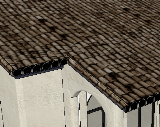
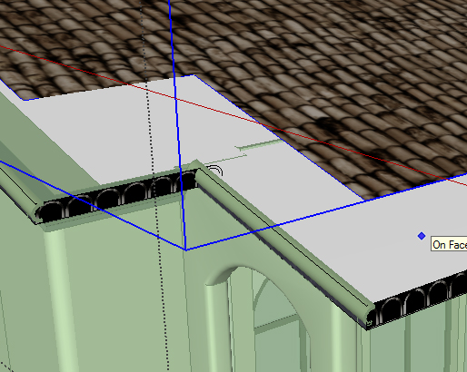
As you see, I put the roof tile plane into a separate component.
You can adapt this solution to displacement carpets or displacement walls.
+ Enhance your perspectives by shades and shadows
If your perspective looks to plain, you can consider adding textures or shadows such as tree shadows to increase texture richness.

Before adding additional shadows to your perspectives, these are things to be considered:
- Direction of light – the direction of shadows should be consistent for the whole image. For exterior perspectives, sunlight is the major source of light. Its direction should be from the appropriate directions which show highlight, midtone, and shadow of the architecture. The light should not come from the back side of architecture at all (it will make your architecture look so dark!). Also, there should be no direct glare to distract readers from the architecture itself. The appropriate direction of light will enhance depth of your perspective. See example from image (C) & (D).
- Quality of light – hard vs soft lighting, shadows are softer in the cloudy day.
- Source of light – one perspective can have more than one sources of light. However, different sources of light create different effects.


Really awesome work!!!!