
Too Drunk to Drive?
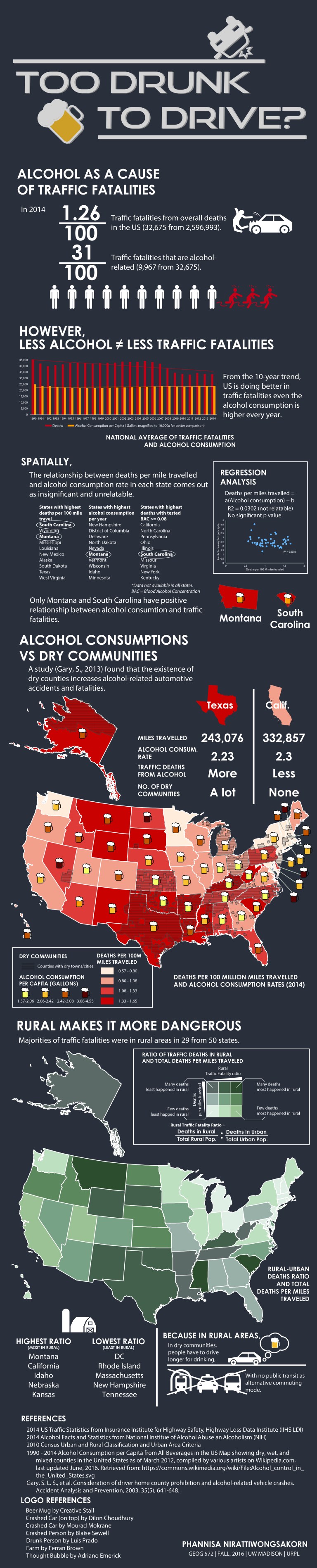
Alcohol is a big part of traffic fatalities in the US every year. But is it always true? There are pieces of evidence showing that rural areas and dry communities might be the true cause of fatalities hiding under the word ‘drunk driving’. The infographic has been created to narrate readers through the drunk-driving statistics.
Production techniques
- Microsoft Excel for exploratory data analysis and linear regression analysis
- ArcGIS for mappings and analyses
- Illustrator for presentation and post-production
Dry Communities
According to Wikipedia, A dry county is a county in the United States whose government forbids the sale of any kind of alcoholic beverages. Some prohibit off-premises sale, some prohibit on-premises sale, and some prohibit both. Hundreds of dry counties exist across the United States, a majority of them in the South.
1st Map: Alcohol Consumption VS Dry Communities
The map was designed to represent 3 sets of information by state: traffic fatalities per 100,000,000 miles traveled, alcohol consumption per capita, and locations of dry communities in the United States. The purpose is to show that the locations of dry communities are more related to traffic fatalities than alcohol consumption.
- Traffic fatalities per 100,000,000 miles traveled, the most important information of the map, are represented as the base layer of the map. The red tone was selected to portray dangers and accidents. A darker red represents a higher rate of accidents related to traffics.
- Alcohol consumption per capita is represented by a mug of beer. The darker color of a beer indicates a higher rate of alcohol consumption.
- Locations of dry communities in the United States are represented by a hatch layer on the top of the base layer. A stripe hatch pattern was used because it allows two layers to be overlaid on each other.
2nd Map: Rural Makes It More Dangerous
To reinforce the key message of the infographic, that location is more important than alcohol consumption, the 2nd map is represented using ‘Bivariate Choropleth Map’ technique. The technique is designed to represent a relationship between 2 variables by 2 colors schemes, which is green for rural traffic fatality ratio, and grey for deaths per mile traveled. Hence, the darker green means traffic fatalities happened more in rural areas. Meanwhile, the darker grey means higher traffic fatalities.
We can see that the patterns of the 2 maps are very similar to each other which means that geography is the real cause of traffic fatalities.
Conclusion
I conclude that traffic fatalities from drunk driving are more severe in rural areas because people have to drive farther to have a drink, especially in dry communities where people have to drive to other towns just for a pint of beer. Including the fact that there is no alternative transport for drunks, some people are more in danger from drinking because they have to risk themselves driving back home.
For map makers
All spatial statistic analyses were conducted using ArcGIS. However, I used Adobe Illustrator the post-production process as ArcGIS cannot handle aesthetic-heavy presentation. In the case of the beer mugs in the first map, I analyzed the brown-yellow color ramp, 4 breaks, in ArcGIS, and copied the RGB color codes into Illustrator to create beer mug icons.
Other icons and graphics were downloaded from the Noun Project under Creative Commons license.
Remark
This infographic is a part of Graphic Design for Cartography class, University of Wisconsin – Madison, Fall 2016.


Thank you for writing thiss