Disease maps are usually designed to be one-disease-one-map, trying to talk about ten diseases would require ten separate maps. However, it is also possible to put all information about disease into one map with some issues to be concerned:
| One disease one map | Many diseases one map | |
| Pros | § Message of the map is simpler (one message, one map)
§ Easy to produce, do not require extra resources (computer programs and time) § Can be more into details of each diseases |
§ Message of the map can be more complicated, can have more than one meaning
§ More intuitive about relationship among diseases § More concise, can fit many diseases into one map |
| Cons | § Cannot convey information of spatial relationship among diseases
§ Too many maps if there are too many diseases |
§ Requires more resources
§ Can be misleading if the diseases are not related |
Case study
I use Mahidol – Oxford Research Unit (MORU)’s Field Site Map as the case study. The map’s purpose is to represent 1) current research units in Southeast Asia, South Asia, and Africa 2) available resources of each research unit e.g. facilities, lab staff, and disease studies, and 3) current field sites in the regions. I will focus on available disease studies, 11 in total and varied by MORU research unit.
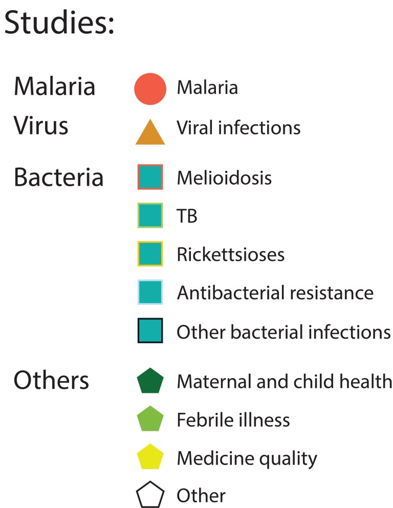
Disease Categorization
- Break the diseases into groups
The studied diseases were broken into 4 disease groups i.e. Malaria, Virus, Bacteria, and other diseases. - Assign a basic shape for each disease group
Simple geometric shapes were assigned to the disease groups e. circle – Malaria, triangle – Virus, square – Bacteria, and pentagon – other diseases. - Assign different details in addition to the basic shape of each disease in the disease group
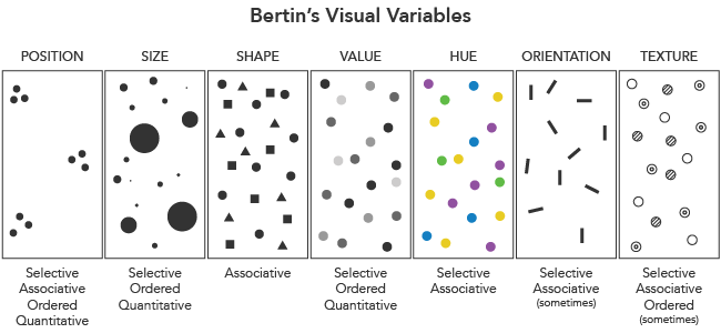
A shape’s border color was assigned to represent different diseases in the same disease group. So, this case is the combination of shape’s color – border’s color. The other possible alternatives can be combinations of position, size, hue, orientation, shape, and texture.
Summary
Complex visual variables require us to use similar shapes to represent different attributes. We often need to employ many iterations of the same geometric shape, such as rectangles with thin and thick borders, to account for the complexity. This leads to a complexity creep and diminished user experience. Therefore, finding the right balance between simplicity of shapes and clarity of feature representation is the key to professional disease map-making.