An interactive map of travel time by cars to the nearest healthcare facility from anywhere in Thailand
by Phannisa Nirattiwongsakorn and Charin Polpanumas (2018)
Rationales
To promote Thailand’s Open Data
Thailand has an open government data Data.go.th, which serves as an aggregator and/or portal to data sources across the government bodies. According to Global Open Data Index, it currently is at 34% score, compared to Singapore (60%), Philippines (30%), Indonesia (25%), Cambodia (17%), Malaysia (10%) and Myanmar (1%). Despite an above average ranking in the region, the data is less than ideal: no APIs available, most of the data are not formatted, few keys to link across and some of them are even in difficult excel sheets and PDFs.
Therefore, we decided to promote the importance of Open Data in the 21st century by developing a real use case for general audiences. Also, to create a stronger statement that Open Data is totally open and free, all data and tools are free (except ArcGIS but QGIS is a free alternative).
To report situations of road accidents and healthcare facilities in Thailand
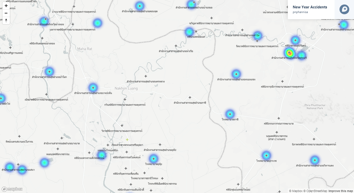
According to WHO’s Global status report on road safety 2015, Thailand has the second highest road traffic-related death rate in the world at 36.2 deaths per 100,000 population losing out only to Libya, and significantly higher than its middle-income neighbors like Vietnam (24.5), Malaysia (24.0), and Indonesia (15.3). Moreover, similar to most countries with a modern lifestyle, leading causes of deaths in Thailand are ischemic heart diseases (12%) and stroke (10%). All these cases — accidents, heart attacks and strokes — have one thing in common: time is of the essence. So far, policymakers have been working in the dark regarding this issue; that is, until we had open government data and decided to do something about it.
Therefore we’ve chosen health-related datasets, i.e. traffic accidents during New Year Holiday 2008 – 2015, and healthcare facilities, to conduct analyses and report the results on a user-friendly and intuitive platform.
To encourage data-based policy making processes
According to my current position as a Plan and Policy Analyst at the Office of National Economic and Social Development Board of Thailand (NESDB), a public agency responsible for national-level policy recommendation, data are not the main part in decision-making processes due to the lack of data, data analysis facilities, and skill sets.
Therefore, we’ve decided that the project is a good catalyst for policymakers to practice using data in policy-making processes.
Methodology
Mapping Procedures
- Full steps with scripts can be found at https://github.com/cstorm125/hosmap/
- Retrieve hospital physical addresses from 26,881 hospitals listed by Ministry of Public Health.
- Augment the data with latitude and longitude using Google Map API.
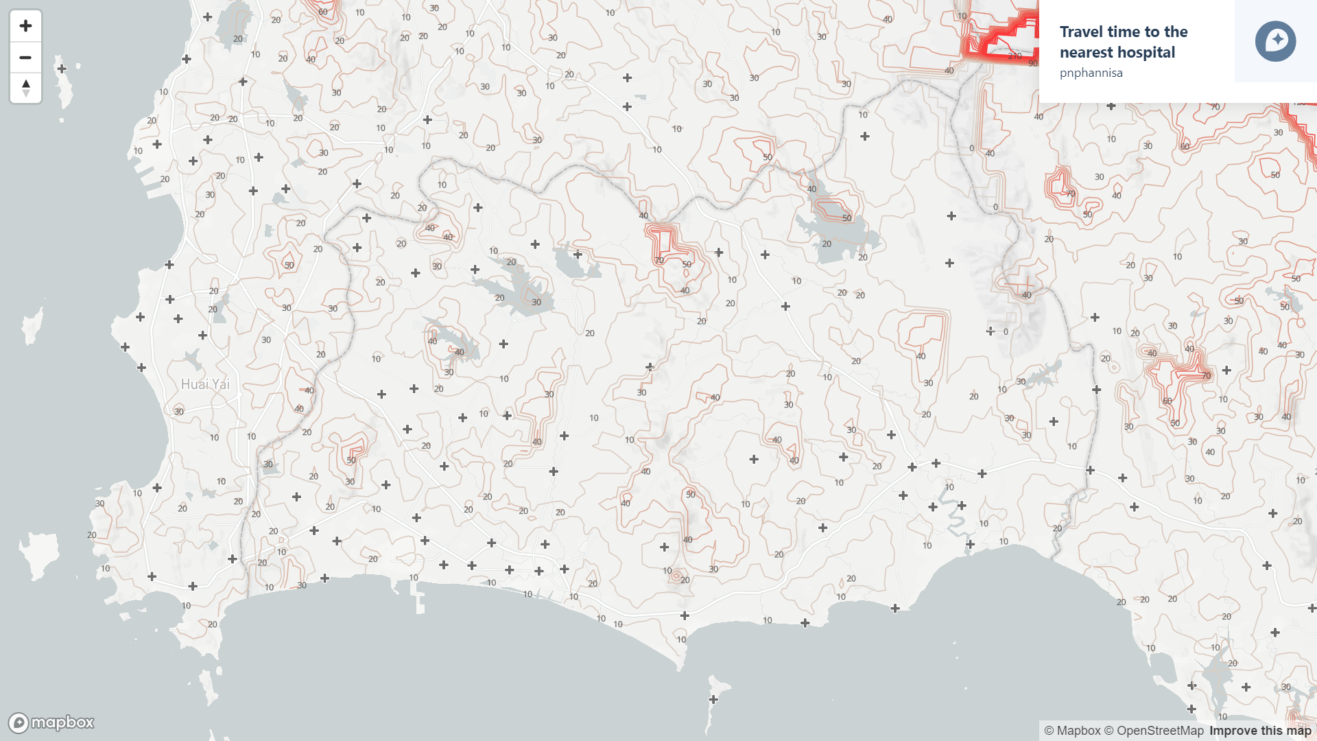
- Creating proxies of all locations in Thailand using ArcGIS to cast 1X1 km fishnets. These locations will be paired with the nearest hospital and calculated the shortest route and time in the next steps.
- Use ArcGIS to find the shortest Euclidean distance between all points to their respective nearest hospitals. This is not ideal since nearest hospitals could be different from nearest Euclidean hospitals in some edge cases but it is a necessary step to save computational power.
- Use Graphhopper API to calculate travel distance and travel time by car from any point to its nearest hospital (about 500,000 points from Step 3 – 4)
- Visualization processes start at this step. Use ArcGIS to plot travel time fishnet and create a Digital Elevation Model (DEM) of ‘travel time by cars to the nearest hospital’ layer.
- Use ArcGIS to convert raster DEM to vector polyline layer of ‘travel time by car to the nearest hospital’ of the 10-minute interval between each contour line.
- Visualize ‘travel time by car to the nearest hospital’ (polyline) and locations of hospitals by Mapbox.
The map as a catalyst to encourage data-based decision making processes
Spatial Science BKK 1st Meetup at GET! Thailand on Nov 9, 2016
A talk on the background of making “Interactive Map : Travel time to the nearest hospital” along with Mr. Sak Segkhoonthod’s, Director of Digital Government Development Agency, talk on Thailand Open Government Data’s framework.

KM Policy Workshop at Office of National Economic and Social Development Board of Thailand (NESDB) on Nov 16, 2016
Along with a talk on the background of making “Interactive Map : Travel time to the nearest hospital”, the map was used as a workshop media, allowing participants to brainstorm health-related policies’ problems, opportunities, interventions, impacts, partners, and beneficiaries in “the Public Policy Lean Canvas”.
The result was suggestions on the future healthcare initiatives i.e. hospital clustering, data and service sharing within hospital groups, and elderly care district.

Limitations
- The proxy locations are at 1 km by 1 km interval which can be too sparse for urban areas with higher density such as Bangkok as the project’s scope is the whole country. Therefore, we recommend to specify smaller interval for city-scaled or smaller projects.
- Shortest routes between proxy locations – its nearest hospital is calculated by Open Street Maps instead of Google Maps which might be more accurate, as all datasets and tools must be free of costs (estimated fees of Google Maps for this project is 2X,XXX THB). Thus, we recommend to use Google Maps for projects that need better accuracy.
- The calculation model is lenient, no traffic data and other health-related conditions of travelers taken into account.
Recommendation
- More Open Data.
- To create a good environment of data-based decision making, the government should invest in data collection, data facilities, data sharing, and capacity building.
References
Links to the project information and other write-ups:
Data sources:
- Thailand’s Government Open Data
- Ministry of Public Health of Thailand
- Google Maps
- Open Street Maps
- United States Geological Survey (USGS)
Tools used for data management and visualization:
- ArcGIS
- Google Map API
- Open Street Map API
- Kepler.gl
- Mapbox